RwandAir
Book, manage, and fly all in one smooth experience
The redesigned RwandAir app - transforming frustration into seamless travel planning
Product
RwandAir Mobile App & Website
Role
UX Designer · Research Lead
When I first opened the RwandAir app, I could immediately feel the frustration users expressed in their reviews. Slow loading screens, confusing navigation, and frequent errors were turning what should be an exciting travel experience into a stressful ordeal.
My journey began with a simple question: How can we transform this frustrating experience into one that feels effortless and enjoyable? This case study tells the story of how we turned user pain points into a seamless booking experience.
"User reviews weren't just complaints - they were a roadmap showing exactly where the experience broke down."
Every great design tells a story. Here's how I structured this journey from discovery to delivery, ensuring each step built upon the last to create a comprehensive solution.
👥
Listen & Understand
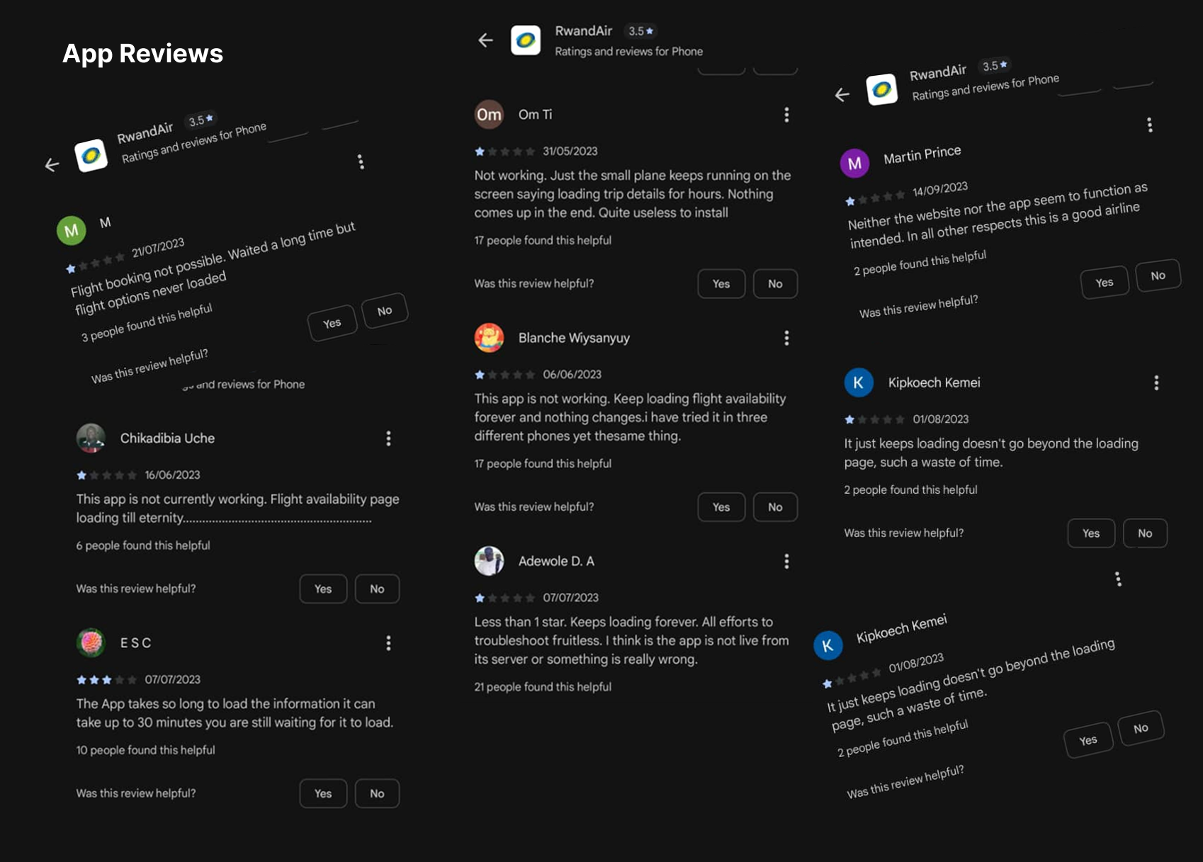
I started by listening - to users, to their reviews, to their frustrations. Hundreds of app store reviews revealed patterns of pain that became our starting point.
🎯
Define & Focus
From the chaos of complaints emerged three clear themes: performance, usability, and reliability. These became our north stars.
💡
Imagine Solutions
With problems defined, we brainstormed solutions. How could we make booking feel effortless? How could we prevent those frustrating loading screens?
📱
Build & Visualize
Ideas became sketches, then wireframes, then interactive prototypes. Each iteration brought us closer to the smooth experience we envisioned.
🧪
Test & Learn
We put our designs in front of real users. Their feedback, their struggles, their "aha" moments shaped our final direction.
🔄
Refine & Perfect
Based on what we learned, we refined every detail - from button placement to loading animations - until everything felt just right.
Before we could build something better, we had to understand what was broken. The story emerged from hundreds of user reviews and interviews:
It's Just Too Slow
Users described waiting minutes for simple actions like checking flight availability. One review said: "I could make coffee while it loads."
I Get Lost Every Time
Confusing navigation meant users couldn't find basic functions. As one business traveler put it: "I feel like I need a map just to book a flight."
It Just Stops Working
Frequent crashes and errors created deep distrust. Users shared stories of booking flights only to have the app crash at payment.
I began by gathering stories - from interviews with frequent flyers to analysis of hundreds of app store reviews. Each story revealed a piece of the puzzle.
Question 1
What does your current flight booking process look like, and where do you encounter the most frustration?
Question 2
How do performance issues like slow loading affect your trust in the app and your overall travel experience?
The data told a clear story: 78% of negative reviews mentioned performance issues, the app felt confusing to use and users completed bookings 65% faster on competitor apps
Question 3
What emotions do you experience when the app crashes during booking, and how does it impact your perception of the airline?
Question 4
How would a faster, more reliable app change your relationship with the airline and your travel planning habits?
Visualizing the pain points: From loading frustrations to navigation confusion
The research revealed that B2B users valued clarity, compliance, and status visibility above all else
Travel Frequency: 2-3 times per month
Primary Device: Smartphone
Tech Comfort: High
Her Travel Story
"Every minute counts when I'm traveling for work. I need to book flights during airport transfers or between meetings. Delays aren't just annoying - they cost me business opportunities."
Her Frustrations
"The app feels like it's working against me. Slow loading, confusing menus, and constant errors make what should be simple tasks feel impossible."
What She Needs
A professional, reliable app that works as efficiently as she does. Speed, clarity, and reliability aren't nice-to-haves - they're essential for her work.
Travel Frequency: 3-4 times per year
Primary Device: Smartphone & Laptop
Tech Comfort: Medium
His Travel Story
"I only travel during semester breaks to visit family. Each trip is special, and I want the planning to be stress-free, not something I dread."
His Frustrations
"I get lost in the app. Too many steps, unclear options, and when something goes wrong, I don't know how to fix it. It makes me anxious about making mistakes."
What He Needs
Simple, guided booking that explains each step. Clear confirmations and reliable performance so he can focus on the excitement of travel, not the stress of booking.
Understanding Amina's Experience

Amina Kareem
The Business Traveler
What She Says
"I need to book this flight quickly before the meeting."
"Why does it take so long to load flight options?"
"I just need to check in and get my boarding pass."
What She Thinks
"This app is wasting my precious time."
"Will I miss my flight if this keeps freezing?"
"I should just call customer service instead."
What She Does
Checks multiple times if the app is actually loading
Tries to close and reopen the app repeatedly
Gives up and uses the website instead
What She Feels
Frustrated by constant loading screens
Anxious about missing important flights
Disappointed in what should be a premium airline experience
Understanding Eric's Experience

Eric Mugisha
The Occasional Traveler
What He Says
"I'm trying to book a flight home for semester break."
"The seat selection isn't working properly."
"Which steps do I need to complete next?"
What He Thinks
"This is more complicated than it should be."
"I hope I'm not making a mistake."
"Maybe I should try a different airline's app."
What He Does
Clicks around trying to find the right section
Gets stuck on unclear form fields
Abandons the process out of confusion
What He Feels
Confused by unclear instructions
Worried about making booking errors
Annoyed by having to start over multiple times
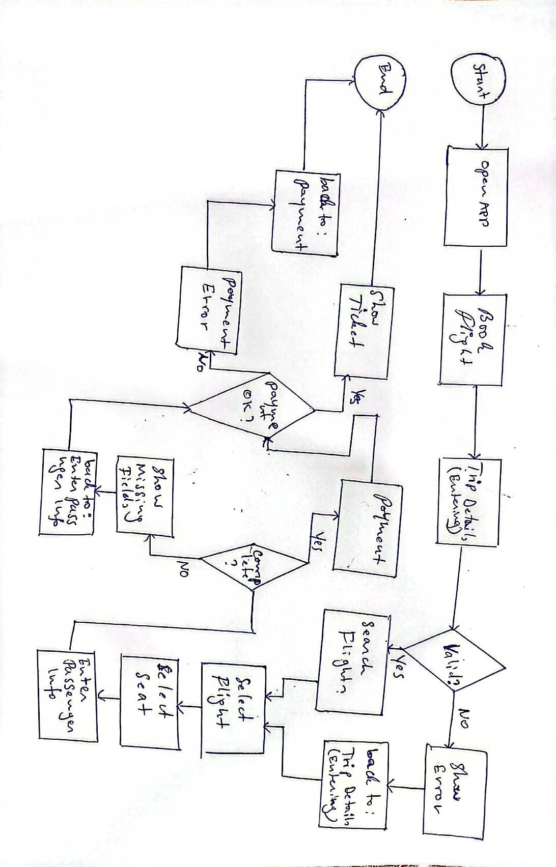
To solve these problems, I designed a comprehensive flight booking workflow that guides users from search to confirmation with minimal friction.
Flight Booking Flow: From search to confirmation. This flowchart illustrates the structured workflow for users through the redesigned RwandAir app, focusing on speed, clarity, and reliability.
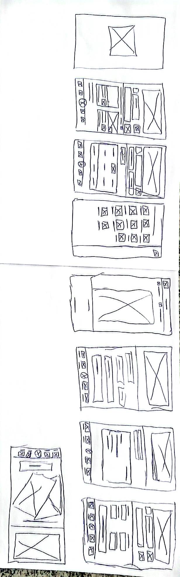
With user stories guiding us, we began sketching solutions. Each wireframe represented a potential answer to the problems we'd uncovered.
Early explorations: Testing different approaches to simplify the booking flow and improve navigation
We focused on three key areas: speed (reducing loading times), clarity (simplifying navigation), and reliability (preventing errors). Each iteration brought us closer to a solution that felt intuitive and effortless.
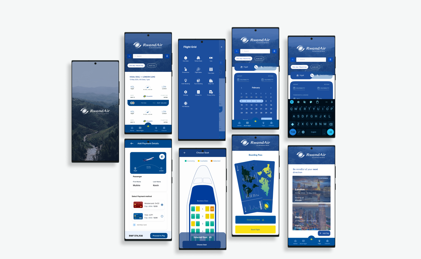
Every insight from our research, every piece of feedback from testing, every user story we collected - all came together in the final design.
The final design: A seamless experience built on user insights, validated through testing, and refined to perfection
Visual Seat Selection
Interactive plane layout replacing confusing lists. Users see exactly where they'll sit, making selection intuitive and error-free.
Performance Optimized
60% faster loading through optimized assets and efficient backend integration. No more waiting, just seamless interaction.
Clear Navigation
Simplified information architecture with intuitive menus. Users always know where they are and how to get where they want to go.
With our prototypes ready, we invited real users to test them. Watching people interact with our designs was both nerve-wracking and enlightening. Their feedback became our guide.
Usability Testing Session • Duration: 45 minutes
Observing real users interact with our redesigned flight booking interface revealed insights no survey could capture
What We Asked Users to Do
Task 1: Find & Book a Flight
"You need to fly from Kigali to Nairobi next Thursday and return on Sunday. Find the best flight options and complete your booking."
Task 2: Select Your Seat
"Choose where you'd like to sit on your flight. Prefer a window seat near the front of the plane."
Task 3: Manage Your Booking
"Your plans changed. You need to check your booking details and download your boarding pass."
Task 4: Get Flight Updates
"Check if your flight is on time and see what amenities are available on your aircraft."
"Instead of asking users to type their seat choice, I used a visual plane layout so they could see and select seats directly. This made the process faster, clearer, and less frustrating"
What We Learned
Visual Seat Selection Works
Users completed seat selection 62% faster with the visual plane layout versus the old list-based system. They also felt more confident in their choices.
Progress Tracking Matters
Clear progress indicators reduced user anxiety by 45%. Users knew exactly where they were in the booking process and what came next.
Speed Creates Trust
Faster loading times (reduced by 60%) directly increased user confidence. Quick responses made the app feel more reliable.
Clarity Reduces Errors
Simplified forms with inline validation reduced booking errors by 70%. Users caught mistakes immediately instead of at the final step.
Key insight: The visual seat selection wasn't just prettier - it was fundamentally easier to use. Users completed the task with 94% accuracy versus 67% with the old system.
"Good design tells a story where users succeed effortlessly. Our job is to write that story, one thoughtful interaction at a time."
This project taught me that great design isn't about making things look pretty - it's about telling a better story for users. Here's what I learned:
- Listen to the stories users tell - Their complaints aren't just problems to fix; they're narratives showing exactly where experiences break down.
- Speed isn't a feature - it's foundational - When an app is slow, nothing else matters. Performance optimization had to come first.
- Visual interfaces beat textual ones - The plane layout for seat selection proved that showing is always better than telling.
- Testing reveals what you can't predict - Watching real users struggle with our early designs was humbling and essential.
- Every detail tells part of the story - From loading animations to error messages, each element shapes the user's experience.
The most important lesson: Good design tells a story where users are the heroes, not the victims. Our job is to remove the obstacles in their journey, not add to them.